
What appears on your product images impacts your visibility in Amazon’s AI-powered search—not just your customers’ purchase decisions. Amazon’s AI processes visual content increasingly in a multimodal way: text on infographics, recognizable objects, and usage scenes. In this guide, you’ll learn how to design images so both humans and machines can understand them.
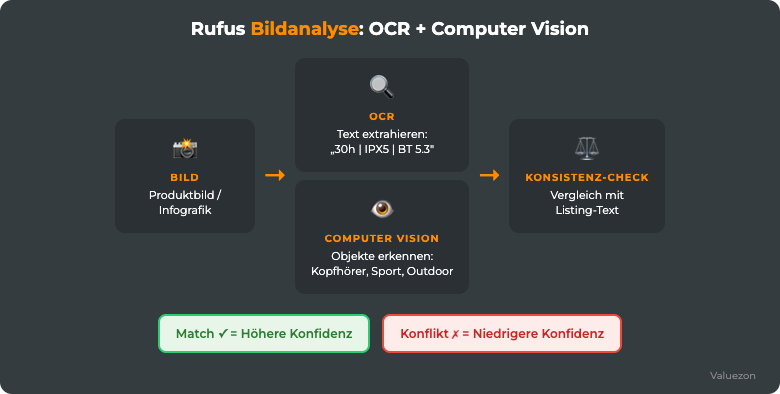
Fig. 1: Two parallel processes. OCR extracts text from your images; computer vision recognizes visual context. Both contribute to AI relevance. Source: Valuezon / Own illustration 2026
In the third blog post of our series, we introduced how Rufus incorporates visual content. In our fifth blog post, multimodal_support was one of the ten core Rufus factors that evaluates whether your visual content strengthens or weakens your textual claims. This article goes a step further. You’ll learn design rules, the optimal image sequence, the COSMO relevance of A+ Content, and receive a proven checklist for your image audit.
Controversial: Does Amazon actually use OCR?
Whether Amazon extracts text from seller images using OCR and incorporates it into ranking has not been officially confirmed. Some Amazon experts explicitly doubt it. On the other hand, modern AI assistants like Rufus are multimodal and can fundamentally process image content. Our position: don’t rely on the mechanics, but on the principle. Whatever a person and a multimodal AI can clearly read on your image can only help. And if you reinforce important messages in the text as well, you remain independent of how Amazon processes images internally.
Note: The COSMO relations and Rufus factors in this article are based on publicly accessible Amazon patents, scientific publications on AI product search, and practical observations from Valuezon’s optimization projects. Amazon does not disclose official details about internal ranking algorithms.
How Rufus Processes Your Product Images: OCR and Computer Vision

In short: Design each infographic so that its core messages are also machine-readable, and reflect them in your listing text. That way, you increase your AI visibility, regardless of how Amazon processes images internally.
At a glance:
- Multimodal AI probably processes images through two routes: text recognition (OCR-like) for writing on images, and computer vision for visual content.
- Text recognition extracts letters, numbers, and symbols from infographics and packshots.
- Computer vision detects objects, scenes, product categories, and context.
- If image claims and listing text match, it boosts confidence; contradictions weaken it.
- A simple Google Lens test shows you whether the text on your infographics is machine-readable.
Before you redesign infographics or revise A+ Content, it’s worth taking a look at what plausibly happens on the AI side when your image gets analyzed. The exact technical process isn’t officially documented. Based on Amazon patents and research on multimodal AI systems, two relevant processing routes run in parallel.
OCR (Optical Character Recognition) converts pixels into text. Font sizes, layouts, and backgrounds play a role here. Detected text can be extracted and incorporated as an additional data point. With a light background, high-contrast fonts, and sizes above 18pt, text recognition is reliable. Ornate fonts, dark overlays, or text on complex backgrounds? That’s where it fails—and you lose potential data points.
Computer vision runs in parallel and analyzes the visual content itself: which objects are recognizable? In what scene is the product shown (kitchen, office, outdoors)? Is it in use? Which colors dominate? This information flows into COSMO relations, especially used_in_loc (place of use) and used_for_eve (purpose of use). A lifestyle photo showing someone running with headphones communicates used_for_eve: Sport even without a single written word.
The hierarchy of data sources for images follows a clear order: listing text (title, bullets, description) has the highest weight. A+ Content ranks second, image OCR third, and computer vision fourth. Images can reinforce text statements but not replace them. They provide additional confidence for data already present in the text, or open new semantic connections via visual context signals.
The Google Lens Quick Test is your fastest practical check. Open Google Lens on your smartphone, point it at an infographic from your listing, and see which text the app recognizes. What Google Lens can’t read, Rufus probably can’t either. This is especially true for text on dark backgrounds, italic fonts under 16pt, and text located in image margins with less than 5% contrast to the surroundings.

Subscribe to our newsletter and receive fresh updates every two weeks.
Infographic Design Rules: What Rufus Can and Can’t Read
Many sellers think what’s included on infographics is a design question. In reality, it’s a data question.
Do’s: What Belongs on Infographics
Specifications with unit: “500 ml”, “6.2 kg”, “A4 format (29.7 × 21 cm)”, “IP67 waterproof”. Short, clear, and unambiguous. Rufus associates this information with queries like “waterproof speaker” or “lightweight gym bag.”
Certifications and standards: “CE-certified”, “BPA-free”, “TÜV Rheinland tested”, “FSC-certified”, “Bluetooth 5.3”. Certifications serve both as trust signals and technical specifications. They strengthen trust_signals in the COSMO model and boost confidence for safety-conscious search queries.
Included items: “1× headphones · 2× ear tips (S/M/L) · 1× USB-C cable · 1× pouch”. Buyers actively look for this information, especially when checking compatibility or set completeness. Rufus can link this content to queries like “headphones include charging cable.”
Compatibility: “Compatible with iOS 16+, Android 12+, Windows 11”. Listing compatibility on infographics reinforces the xCompatibleWith relation and ensures your product appears in device-specific searches.
Dimensions and measurements: Floor plan, height, weight, ideally shown with a comparison object in the image. Computer vision detects scale, and OCR reads the text. The combination is highly effective.
Don’ts: What Rufus Can’t Process
Vague claims without substance: “Premium quality”, “Superior sound”, “Maximum comfort”, “Best choice”. These phrases appear on hundreds of thousands of listings. They contain no semantic information value. Rufus can’t derive any relations from them or match them to search queries.
Superlatives without proof: “#1 Bestseller”, “Test winner 2024”, “Most purchased”. Without context or a source, this is unverifiable for AI and therefore useless.
Price information and discounts: “Now 20% off” or “Only €29.99” become instantly outdated and don’t create useful product relations. Displaying prices on main images also violates Amazon guidelines.
Review scores and star ratings: “4.8 out of 5 stars” on an infographic doesn’t help. Rufus already accesses review data from its database. This redundant information simply takes up space that could showcase real data points.
Before/After example:
| Version | Infographic Text | Usable Data Points for Rufus |
|---|---|---|
| Before | “Superior sound · Premium design · Maximum comfort” | 0 |
| After | “30h battery · IPX5 waterproof · ANC -35dB · Bluetooth 5.3 · 6g per earbud” | 5 |
Five data points instead of zero. Each one can help Rufus match your product to a relevant search: “Headphones long battery”, “sports waterproof headphones”, “Active Noise Cancelling under $200.”
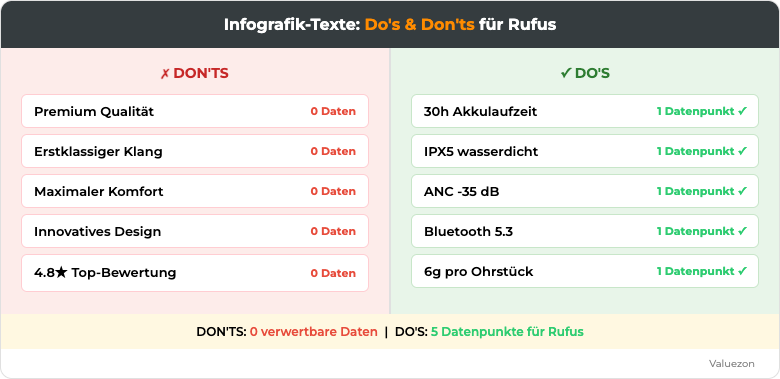
Fig. 2: Do’s and Don’ts. Which content Rufus can process from infographics, and which is just decoration. Source: Valuezon 2026
Lifestyle vs. Info Images: The Optimal Image Order
At a glance:
- Both image types are necessary—they feed different COSMO relations.
- Recommended order: Hero → Detail → Infographic → Lifestyle → Comparison → Lifestyle → Size comparison → Included items.
- Rule of thumb: 60% lifestyle, 40% info when using 7 to 9 images.
- Lifestyle images reinforce
used_for_eve,used_in_loc, andxWant. - Info images reinforce
capable_of,xCompatibleWith, and trust signals.
A common mistake: sellers think they need to choose between lifestyle photos (for buyers) and infographics (for Rufus). They don’t. Both image types deliver completely different information, and both are essential.
Lifestyle images show the product in use—people actually using it, environments where it functions, scenes that trigger emotional buying motives. For Rufus, these are valuable contextual signals: computer vision recognizes where and how the product is being used. A photo of headphones while jogging signals used_for_eve: Sports and used_in_loc: Outdoor. A photo during a home office video call signals used_for_eve: Work and used_in_loc: Home office. Lifestyle images also build xWant signals by showing the lifestyle, state, or experience your product enables.
Info images and infographics provide OCR-readable data: size, weight, battery life, certifications, compatibility, included items. They strengthen capable_of and xCompatibleWith and increase confidence for specification-driven search queries.
The optimal image order with 7 to 9 images:
| Position | Image Type | Function | COSMO Relation |
|---|---|---|---|
| 1 | Hero (cutout) | First impression, clear product recognition | Base |
| 2 | Detail shot | Material, quality, workmanship | trust_signals |
| 3 | Infographic 1 | Top specifications (3 to 5 data points) | capable_of |
| 4 | Lifestyle 1 | Primary usage scene | used_for_eve, xWant |
| 5 | Comparison / Compatibility | Variants, sets, compatible devices | xCompatibleWith |
| 6 | Lifestyle 2 | Secondary usage scene (different context) | used_in_loc |
| 7 | Size comparison | Measurements with reference object | capable_of |
| 8 | Included items | Complete contents | xInterested_in |
| 9 | Infographic 2 / A+ teaser | Certifications, warranty, benefits | trust_signals |
The 60/40 rule of thumb: With 8 images, 5 (62%) should deliver emotional lifestyle and context information, 3 (38%) specification data. This approach appeals to human buyers emotionally—while giving Rufus enough usable data points.
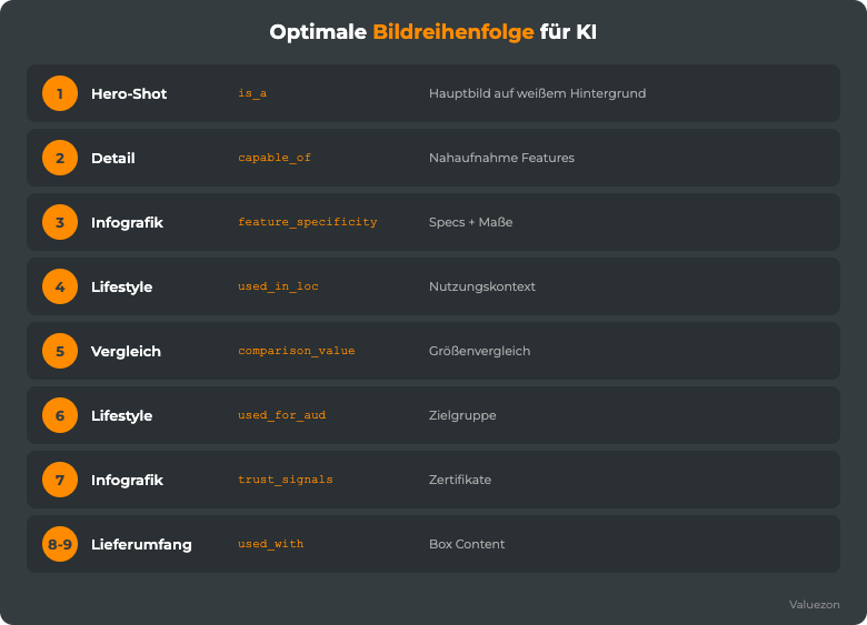
Fig. 3: Recommended sequence for 7 to 9 images. Hero, Detail, Infographic, Lifestyle, Comparison, Lifestyle, Size Comparison, What’s Included. Source: Valuezon 2026
A+ Content as a Relationship Driver
Many sellers treat A+ Content as a visual upgrade: more attractive than the standard description, but essentially just decoration. This misses out on tremendous potential. A+ Content is the only place in the Amazon listing where you can combine longer text, structured images, and a narrative structure. And Amazon’s AI reads this section as well.
Which COSMO relations A+ can feed:
xInterested_in benefits from content blocks that show why a specific customer profile would find this product interesting. Not “Suitable for all,” but “For hobby athletes who want to track their sleep,” or “For parents looking for safe BPA-free products.”
xWant is enhanced by the narrative approach in A+. Not “This product has X feature,” but “Want to unwind after a long day at work? 30 hours of battery life mean your headphones will last as long as your week.”
used_for_aud (target audience) is the domain of the Brand Story. Here you can name and contextualize customer groups: beginners vs. pros, kids vs. adults, occasional users vs. daily users.
used_in_loc and used_for_eve are enriched through lifestyle images and contextual copy in A+. An A+ module titled “In the office, on the go, and at home” with three matching images sends strong location signals.
Effective A+ structure for increased AI visibility:
- Headline module: Product name + strongest unique selling point (max. 160 characters, OCR-friendly)
- Hero module: Large-format lifestyle image with concise headline (max. 5 words, clearly readable)
- Problem/Solution module: Split display, known problem on the left, your solution on the right. Text small, but OCR-suitable.
- Specs module: Comparison table or bullet icons with the top 5 specifications. Good for
capable_of. - Lifestyle module: Two to three usage scenarios with short text. Strengthens
used_for_eveandused_in_loc. - Brand Story: Who is behind the product, who was it developed for, and why should the buyer trust you? Strengthens
xInterested_in,xWant, andtrust_signals.
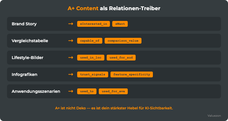
Fig. 4: Each A+ module feeds specific COSMO relations. Nothing is just decoration. Source: Valuezon 2026
Image-Text Consistency: The Invisible Ranking Killer
At a glance:
- Contradictions between image text and listing text lower Rufus’s confidence for the affected data points.
- The most common inconsistencies happen after updates: listing text is changed, but images remain outdated.
- Battery life, IP rating, weight, colors, and what’s included are the five critical areas.
- A simple two-column audit uncovers all discrepancies.
Rufus performs an implicit consistency check. When the listing headline says “30h battery” and the infographic shows “28h battery,” a confidence conflict arises. Rufus has to decide which data point to trust, or it reduces the weighting of both. The result: a weaker signal for search queries like “headphones long battery life.”
This kind of contradiction creeps into almost every listing that’s been live for a few months. At some point, the listing text is updated while the images remain outdated.
The five critical consistency areas:
Battery life / operating time: Numbers must match exactly, including the conditions (“up to 30h at 50% volume”). Rounded numbers in the listing and exact numbers on infographics always create conflicts.
IP rating / water resistance: “Waterproof” in the text and “IPX5 splash-proof” on the infographic are technically different statements. Either specify the exact IP class everywhere, or don’t use it on infographics at all.
Weight and dimensions: If your title claims “ultra-light 185g” but the size infographic shows “192g,” you’ve got a problem. Most likely a product update wasn’t implemented across all assets.
Colors and variants: If an infographic shows a color option that isn’t available as a variant in the listing, Rufus counts this as an inconsistency. This is especially critical in ASIN families where infographics are shared across variants.
Scope of delivery: If the scope text in the bullet points says “includes USB-C charging cable” but the infographic doesn’t show a charging cable (or shows a Micro-USB cable), this is a classic contradiction after product updates.
The 2-column audit: Create a table with two columns. On the left, list all specifications from your listing text (title, bullets, description). On the right, all texts extracted from your images via Google Lens or OCR tool. Every discrepancy is a point of action. This audit takes about 20 to 30 minutes for an average listing and typically reveals 3 to 5 inconsistencies.
Practical Example: Infographic Redesign
Let’s look at an example that regularly comes up during our listing audits. A mid-range Bluetooth headset (45 to 75 €), which, despite good product quality and decent reviews, shows weak visibility for AI-powered search queries.
Initial situation, Infographic Image 3 (Before): The third image was an infographic with three large, curved text blocks in decorative font: “First-class Sound,” “Premium Design,” “Maximum Comfort.” Visually appealing design. A blurred product photo as background and the brand name displayed prominently at the top. The image appeared high quality—at least to human visitors.
For Rufus: 0 usable data points. OCR can barely read decorative fonts on complex backgrounds reliably. And even if it could, “First-class Sound” doesn’t provide any meaningful information. Rufus can’t derive any relation from that.
Redesign, Infographic Image 3 (After): Bright background (98% white). Product photo small in one corner. Five data points in clear sans-serif (Inter, 22pt), bold, dark on light: “30h battery · single charge”, “IPX5 waterproof”, “ANC -35dB noise cancelling”, “Bluetooth 5.3 low-latency”, “6g per earpiece.”
Five data points. Each matches real search queries: “Headphones 30 hour battery,” “waterproof sport headphones,” “Active Noise Cancelling ANC headphones,” “Bluetooth 5.3 headphones,” “lightweight in-ear sport headphones.”
The impact on the multimodal_support score (measured using the BoostAI rating system): Before the redesign: 2/10—AI had barely any visual data points. After the redesign: 8/10—five clearly readable specs reflected in the listing text, no contradictions, lifestyle images with visible usage scenario.
The redesign did not change the product itself, nor did it invent any new features. It simply translated the existing product attributes into a format Rufus can process. That’s all. But that’s enough.
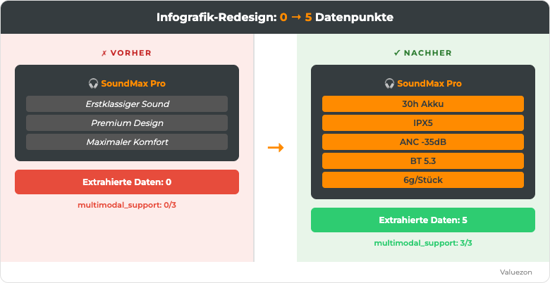
Fig. 5: Before—0 data points for Rufus; after—5 specific specs, OCR-optimized and consistent with the listing text. Source: Valuezon 2026
Image Audit Checklist: Your 4-Step Process
Step 1: Analyze and inventory your images
Download all images from your listing and create a table:
| Image # | Image type | Main content | Text present? | Text readable? |
|---|---|---|---|---|
| 1 | Hero | Packshot | No | n/a |
| 2 | Detail | Material close-up | No | n/a |
| 3 | Infographic | Marketing claims | Yes | Unclear |
Classify each image type (hero, detail, infographic, lifestyle, comparison, scope of delivery). Note which images contain text and if that text can be read by OCR (run a Google Lens test).
Step 2: Consistency check—text vs. image text
Create the two-column table from the previous section. Use Google Lens (or an OCR tool like Adobe Acrobat) to extract all text from your infographics. Compare each value with the corresponding value in your listing text. Mark discrepancies in red, matches in green. You’ll instantly see where action is needed.
Step 3: Prioritization—the three most common errors
Not all problems are equally critical. Prioritize by impact:
High: Contradictions in main specifications (battery, weight, IP rating). These affect the most commonly used filters and key buying decisions.
Medium: Missing data points on infographics. You lose opportunities, but there’s no active negative signal.
Low: Suboptimal image order, missing lifestyle variants. Important for fine-tuning, but not an urgent fix.
Step 4: Implementation—updates and wait time
Upload revised images. Make sure that all infographic texts are also reflected in the listing text (bullets or description). Update A+ Content if needed.
Then: Wait 48 hours. Amazon’s AI does not re-index listings in real time. After 48 hours, monitor impressions and CTR for affected keywords. Measurable changes typically appear within 5 to 10 days following the update.
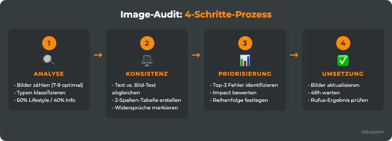
Fig. 6: Complete image audit in 45 to 90 minutes. Four steps, clear priorities. Source: Valuezon 2026
Free AI-Readiness Analysis
How AI-ready are your product images? Our BoostAI Score rates your listing based on all 15 COSMO and 10 Rufus factors, including
multimodal_support. You’ll receive a detailed report: which images Rufus can’t read, where consistency issues exist, and which three actions would have the greatest impact. 100% free for one ASIN.
Frequently Asked Questions about Multimodal Listing Design
Does Amazon Rufus really read the text on product images?
Probably, though it hasn’t been officially confirmed. Modern AI assistants like Rufus are multimodal and can process text and content from images. Whether this works through standard OCR and directly affects ranking is debated among Amazon experts and not documented by Amazon. You can indirectly check machine readability using the Google Lens test: whatever Lens recognizes is typically also readable for other image models. Regardless of the mechanics: clearly legible image statements, reflected in the listing text, are helpful; vague decorative claims are not.
How many images should a good listing have?
Amazon allows up to 9 images (including the main image). We recommend 7 to 9 images in the following order: Hero → Detail → Infographic → Lifestyle → Comparison → Lifestyle → Size Comparison → Included Items → (optional: A+ Teaser or second Infographic). With fewer than 5 images, you typically miss out on lifestyle context or key specifications. With 9 images you can showcase all COSMO relations.
What technical rules apply to OCR-readable infographic text?
The most important: minimum font size 18pt (preferably 20 to 24pt for small images), sans-serif fonts such as Inter, Roboto, or Open Sans, contrast ratio of at least 4.5:1 between text and background (WCAG AA as reference), no text over complex or colored backgrounds, no italic or decorative fonts for specs. Light gray text on white is one of the most common OCR killers.
Is A+ Content important for AI visibility or just for buyers?
Both. A+ Content is indexed by Amazon AI, including both text and images. Its advantage over standard listings: longer text allows for deeper semantic enrichment of COSMO relations, especially for xInterested_in, xWant, and used_for_aud. Studies also show that A+ Content increases conversion rates by 5 to 10%. AI-readiness and shopper-readiness are not mutually exclusive—in fact, well-structured A+ Content is effective for both.
How can I test if my infographic text is OCR-ready?
Three methods: First, the Google Lens Test. Use your smartphone camera on the infographic, activate Lens, and check which text the app recognizes. Second, screenshot + Adobe Acrobat—import the image as a PDF and let Acrobat detect text. Third, a simple contrast check using web tools that measure contrast between text and background color. If none of the tests reliably recognizes text, Rufus won’t be able to either.
Sources
- Amazon Science: Rufus, Product Understanding for E-Commerce Search
- Amazon COSMO: World Knowledge-based Knowledge Graph for E-Commerce (arxiv.org)
- W3C WCAG 2.1, Contrast requirements for readable text (4.5:1 minimum)
- Amazon Seller Central: Product Image Requirements and Guidelines
- Amazon Advertising: Impact of A+ Content on Conversion and Visibility
- Multimodal Product Understanding, AI Analysis of Text and Image in E-Commerce (arxiv.org)
Next article in this series: Review management for the AI era. How Rufus reads reviews, which review patterns influence sentiment scores, and why review quality matters more than quantity today.